Typography embodies our values and personality. It gives us credibility, consistency and distinctiveness.
PT Serif
Source Sans 3
PT Serif Bold:
Now this is a credible but friendly headline.
Source Sans 3 Regular:
This might get technical, so listen carefully.
PT Serif Pro Regular:
This might get technical, so listen carefully.
Source Sans 3 Regular:
And follow it up with some practical, but oh-so-readable body copy.
Source Sans 3 Regular:
And follow it up with some practical, but oh-so-readable body copy.
PT Serif
PT Serif Bold:
hello ecosystem
PT Serif Bold Italic:
hello ecosystem
About PT Serif:
PT Serif is a unique and very important typeface for modern digital and display communications.
PT Serif is a transitional serif typeface with humanistic terminals. It is designed for use together with rounded sans serif pairings, and is harmonized across metrics, proportions, weights and design.
The family consists of six styles: regular and bold weights with corresponding italics form a standard font family for basic text setting; two caption styles in regular and italic are for use in small point sizes.
Designed by Alexandra Korolkova, Olga Umpeleva and Vladimir Yefimov and released by ParaType in 2010.
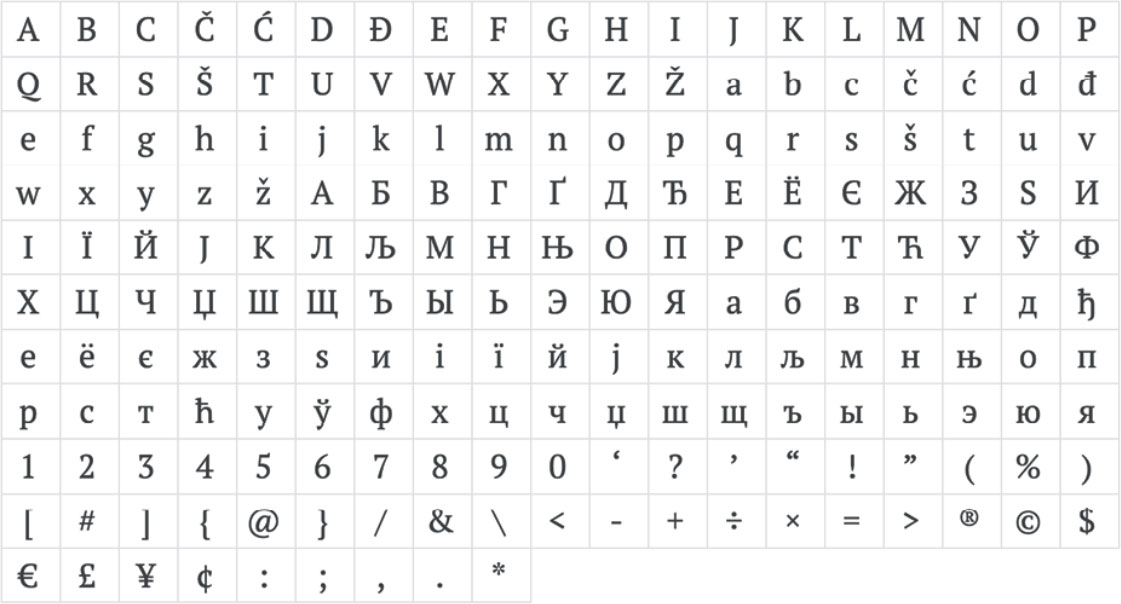
Glyphs:
Source Sans 3
Source Sans 3 Light:
We are doctors.
Source Sans 3 Regular:
We are doctors.
Source Sans 3 Semibold:
We are doctors.
Source Sans 3 Bold:
We are doctors.
Source Sans 3 Black:
We are doctors.
About Source Sans 3:
Source® Sans Pro, Adobe’s first open source typeface family, was designed by Paul D. Hunt. It is a sans serif typeface designed to work well in user interfaces. The typeface is inspired by the forms of the American Type Founders’ gothics by Morris Fuller Benton, modified with both a larger x-height and character width and more humanist-influenced italic forms.
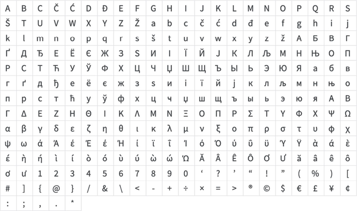
Glyphs:
Standard Type Combo
Should be used wherever possible and as a part of all advertising/ marketing materials where legibility is not an issue.
- Headline (sentence case)
- 32pt PT Serif Bold
- 34pt Leading, 0pt Tracking
A well-oiled wellness machine.
- Subhead (sentence case)
- 16pt Source Sans Pro Italic (or Regular)
- 19pt Leading, 5pt Tracking
athenahealth is built to make your practice run more efficiently.
- Body Copy (sentence case)
- 8pt Source Sans Pro Light
- 12pt Leading, 25pt Tracking
Lorem ipsum dolor sit amet, consectetur adipiscing elit, sed do eiusmod tempor incididunt ut labore et dolore magna aliqua. Ut enim ad minim veniam, quis nostrud exercitation ullamco laboris nisi ut aliquip ex ea commodo consequat.
- Body Copy ALT (sentence case)
- 8pt Source Sans Pro Regular
- 12pt Leading, 25pt Tracking
Lorem ipsum dolor sit amet, consectetur adipiscing elit, sed do eiusmod tempor incididunt ut labore et dolore magna aliqua. Ut enim ad minim veniam, quis nostrud exercitation ullamco laboris nisi ut aliquip ex ea commodo consequat.
Alternate Type Combo
Should be used as secondary headers, section dividers and in complimentary copy. Can also be used wherever legibility is an issue.
- Headline (sentence case)
- 32pt Source Sans Pro Bold
- 34pt Leading, 0pt Tracking
We make connections.
- Subhead (sentence case)
- 16pt Source Sans Pro Italic (or Regular)
- 19pt Leading, 10pt Tracking
Join our data-powered healthcare ecosystem.
- Body Copy (sentence case)
- 8pt Source Sans Pro Light
- 12pt Leading, 25pt Tracking
Lorem ipsum dolor sit amet, consectetur adipiscing elit, sed do eiusmod tempor incididunt ut labore et dolore magna aliqua. Ut enim ad minim veniam, quis nostrud exercitation ullamco laboris nisi ut aliquip ex ea commodo consequat.
- Body Copy ALT (sentence case)
- 8pt Source Sans Pro Regular
- 12pt Leading, 25pt Tracking
Lorem ipsum dolor sit amet, consectetur adipiscing elit, sed do eiusmod tempor incididunt ut labore et dolore magna aliqua. Ut enim ad minim veniam, quis nostrud exercitation ullamco laboris nisi ut aliquip ex ea commodo consequat.
Long Copy Alternative
In some applications, a Serif may be more readable and easier on the readers’ eyes.
For Case Studies, Editorial Content and longer form articles, PT Serif can be utilized as an alternative typeface.
- 10pt PT Serif Regular
- 14pt Leading, 5pt Tracking
An article about healthcare things.
Written by Danny DeVito.
When Jennifer Gruger took on the role of telehealth project manager at Gerald Champion Regional Medical Center, she was excited about the possibilities of virtual care. “We saw the future of telemedicine as a costeffective way of reaching underserved populations and growing our patient base,” she said. Then the pandemic started. Charged with implementing another vendor’s telehealth software, Gruger says the need for multiple logins frustrated physicians and patients and prompted Gruger to recommend a swift pivot to athenaTelehealth.
athenaTelehealth integrated seamlessly with Gerald Champion’s current platform, athenaOne, and was embraced by physicians seeking solutions to care for patients remotely during the pandemic. “Our providers found athenahealth’s telemedicine visits very efficient,” said Gruger. “We quickly ramped up our use of athenaTelehealth and were able to comfortably get our patients into a secure, HIPAA-compliant environment.”
Physicians appreciate the flexibility that athenaTelehealth provides. athenaTelehealth is embedded in the EHR so physicians can document during patient visits while providing face-to-face care. Physicians and office staff can convert scheduled, in-person visits to telehealth visits with just a few clicks, and easily fill open appointment slots. These capabilities support physician productivity and satisfaction with the technology.
Sizing ratio
We can aim to format our headlines, subheads, and body copy by a general 4: 2: 1 ratio. The subheads are 1/2 of the headline size, and the body copy is 1/4 of the headline size. This won’t always form a perfect number, but we can round up or down as needed.
There should be some flexibility to this ratio depending on the length of the headline and subhead so that lines break and fit under each other in a way that looks best. In small sizes, like banners, we may need to increase font sizes a bit to prioritize legibility.
- 100pt headline
- 50pt subhead
- 20 pt body copy
- 64pt headline
- 32pt subhead
- 16 pt body copy
- 32pt headline
- 16pt subhead
- 8 pt body copy
Headline (100pt)
Subhead (50pt)
Body Copy (20pt)
Download Our Fonts
Our fonts are Open Source
Our fonts and icons are free and open source, marking beautiful typography and iconography accessible to anyone at athenahealth. This means you can easily download and collaborate with colleagues, without fear of broken files, licensing issues or cost implications. Google fonts takes care of all the licensing and hosting, ensuring that the latest and greatest version of our fonts are always available to everyone.


