Usage Summary
Marketing, Brand & External Communications
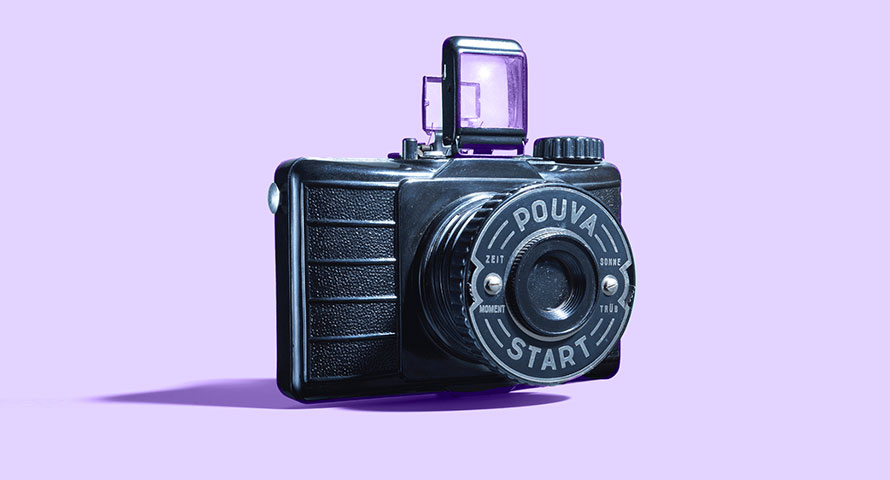
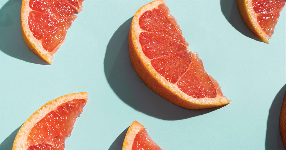
Colorful World Photography:
These photos will be used to show real people, places and objects when we need to be more specific.
- Advertising/Marketing Campaign
- Digital and Internal
- Case Studies
All Communications
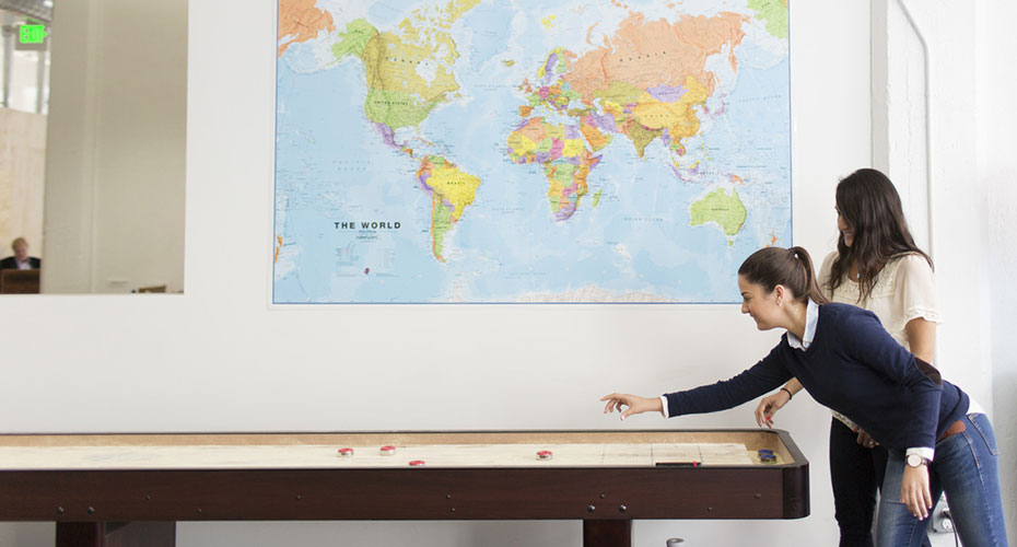
Full-Bleed Photo:
This is complimentary imagery used as a companion to a colorful header or “designed” master image. It is literal.
- Website
- Case Studies
- Specific places and things
- Hardworking business collateral
- Complimentary/Secondary imagery in Campaign
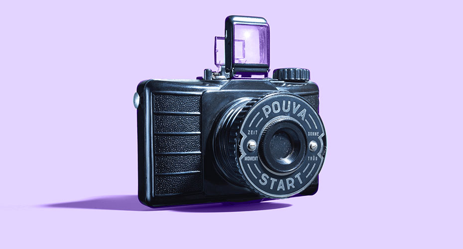
Colorful World
Oh yes. Color feels nice.
Using our color palette, we’ll create a world that is vibrant, energetic, artful and modern in it’s ability to frame objects, products, people and metaphors.


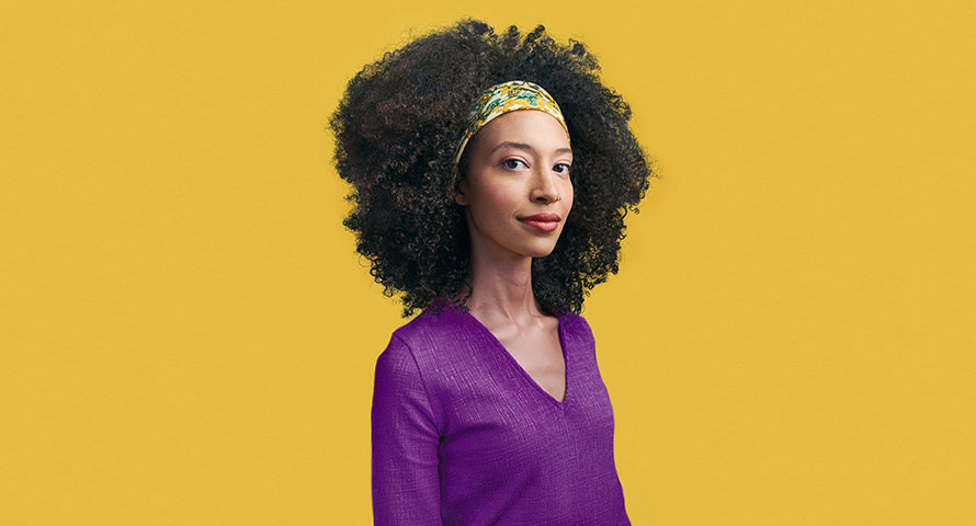
How we use purple
Purple is our hero.
And incredibly flexible.
In the taxonomy of our color usage, purple is the color we lean on most often.That does not mean we need to overly saturate every piece of communication with the color purple.
On the contrary, it can be used in a variety of ways- from a fully saturated background color to a more subdued, but complimentary highlight color. And even in more subtle ways as an accent, spot or typographic color. There may be specific scenarios where purple does not work or cannot be utilized and that’s ok too. But look for opportunities to utilize purple wherever possible.


Photography
What if i need to use non-stylized photography?
Is that ok?
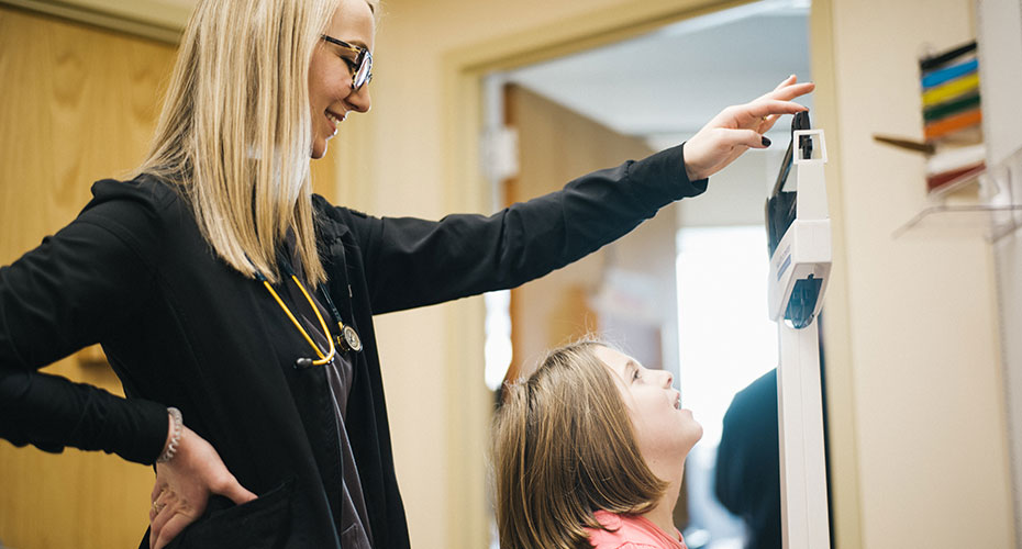
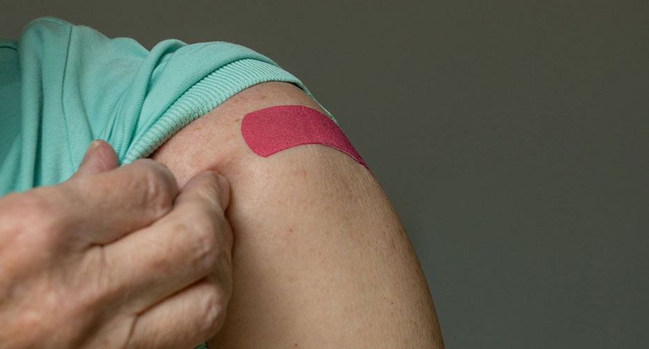
Yes, of course. Our colorful world works best for conceptual and campaign-driven moments, but it can and should be supported by full bleed photography where it feels right.
In these instances, our photographic style should feel approachable, composed and naturally lit where possible. It is never staged, fake or stock feeling. There is a voyeuristic quality to the images, as if we just walked in on a moment in progress.
The shots should feel candid and have an air of positivity, without feeling forced. In contexts that require more serious subject matter or heavy topics, we will convey a sense of confidence rather than fear or sadness.


Complimentary Styles

Colorful World.
Our colorful world will most often be used in our advertising and marketing materials. And generally in placements that require a more artful, conceptual approach. Mastheads, publication covers, infographics and signage can also benefit from the added layer of energy that our colorful world provides.
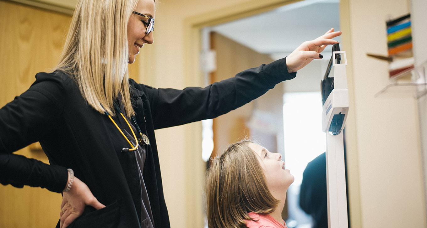
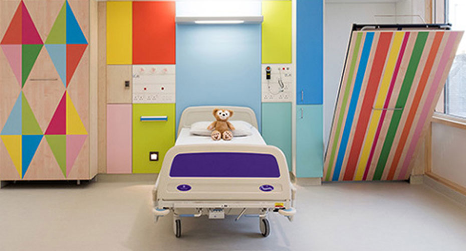
Full-Bleed Imagery.
Healthcare is a complicated business. The need to show clinicians, hospitals and doctors in actual practice will not go away just because we’ve adopted a vibrant color palette. Typically, these real-world applications will best be used for assets in the mid to lower funnel applications. Our case studies, website and content will utilize this practical imagery as needed.

Combinations.
Don’t be afraid to use both worlds together in complimentary ways. Typically, these will work together best in placements that require or house multiple images- web pages, editorial publications, etc.
DO NOT (PEOPLE)
GUIDE: What not to do.

Avoid the cheeseball trap. This is not an episode of “Grey’s Anatomy.” Portraits should feel natural and candid. Looking off-camera is a plus.

Do not use images that feel wildly unrealistic and phony. Instead, strive for natural workplace scenarios.

We represent a noble profession. We should always portray it with authenticity and integrity.

Do not pose patients and providers in a way that feels posed. Avoid awkward touching or violations of personal space.

Avoid images with a shallow depth of field. They do not work well on colorful backgrounds and feel sloppy. Flat focus is good.

Do not shoot subjects from low or high angles. Displaying these images on colorful backgrounds will melt your brain.
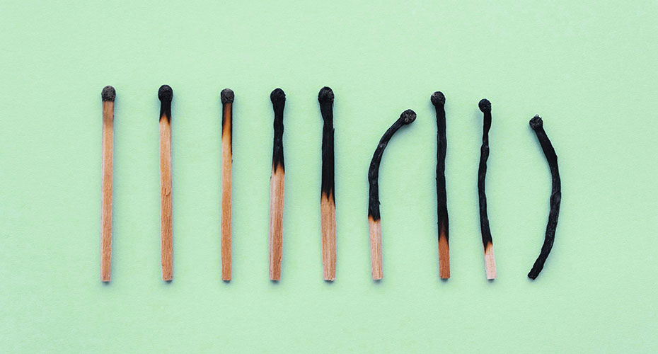
DO NOT (OBJECTS)
GUIDE: What not to do.

Do not mix photography and 3D elements within a single composition.

Objects should be photographed within our colorful world. Or within a real work/office environment. Alternate stylized worlds are not advised.

Keep the background simple. Surfaces are ok, but combining two or more colors (without a conceptual reason) is not advised.
Colorful World objects should not be shot outside or with natural light. Instead, they should be shot in a controlled, studio environment.

Do not use patterned, busy or non-brand approved backgrounds.

Minimalism and negative space are good. Crowded layouts and too many objects get messy.
Images shown here are stock, not our actual brand photography.


