Color creates energy and emotion. It triggers memory, gives sensation and creates a brand universe to inhabit.
Hero Purple
- RGB: 78 | 45 | 130
- CMYK: 87 | 100 | 12 | 2
- Hex: 4e2d82
- PMS: 2091 C
Lite Purple
- RGB: 156 | 40 | 177
- CMYK: 50 | 90 | 0 | 0
- Hex: 9c28b1
- PMS: 2592 C
Orchid
- RGB: 180 | 0 | 91
- CMYK: 25 | 100 | 43 | 6
- Hex: b4005b
- PMS: 215 C
Forge Blue
- RGB: 4 | 102 | 180
- CMYK: 91 | 61 | 0 | 0
- Hex: 0466b4
- PMS: 300 C
Peacock
- RGB: 90 | 183 | 206
- CMYK: 65 | 11 | 17 | 0
- Hex: 5ab7ce
- PMS: 631 C
Honey
- RGB: 243 | 166 | 28
- CMYK: 3 | 39 | 100 | 0
- Hex: f3a61c
- PMS: 130 C
Lime Green
- RGB: 88 | 156 | 72
- CMYK: 71 | 17 | 96 | 3
- Hex: 589C48
- PMS: 7738 C
Cream
- RGB: 242 | 236 | 222
- CMYK: 4 | 5| 12 | 0
- Hex: f2ecde
- PMS: 9224 C
Gray
- RGB: 109 | 110 | 111
- CMYK: 58 | 49 | 48 | 15
- Hex: 6d6e6f
- PMS: 4292 C
Primary colors
Our primary colors are Hero Purple, Honey Yellow, Peacock Blue, and Orchid. These can be used as standard, flat colors or with grain and a gradient light source.
Secondary colors
Our secondary colors will not be used as often, but can be supplemented as highlights, accents, complimentary or additional colors as needed.
*Black for typography only.
Grain & light source
We use “light sources” created with a subtle gradient progression that give our backgrounds a subtle sense of optimism. We also utilize a minimal grain structure to give it some life.
These are our primary backgrounds and are used most often.


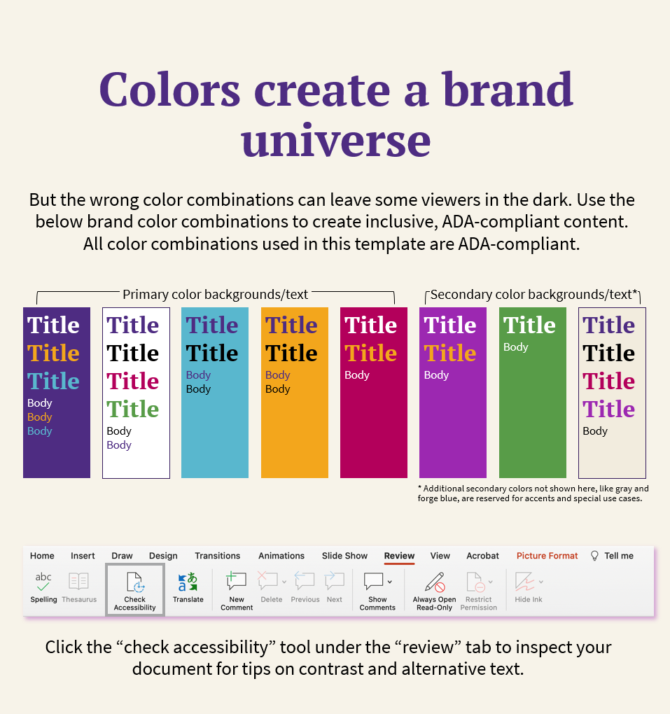
ADA Compliance
The following color combinations within our brand color palette are the only combinations that are ADA compliant and are the only combinations for color and text that should be digital materials.
Headings:
White
Yellow
Body Copy:
White
Yellow
Headings:
Purple
Body Copy:
Purple
Headings:
Purple
Body Copy:
Purple
Headings:
White
Yellow
Body Copy:
White
Headings:
White,
Yellow
Body Copy: White
Headings:
White
Body Copy: White
Headings:
White
Body Copy: White
Color codes
Which Code Do I Use?
Great Question. While codes to your left may look daunting. It is not as scary as it looks. Here's a quick and helpful explanation:
RGB
Made for screens. It is a color gamut rendered using Red, Green and Blue values. This is the value the organization will use most.
CMYK
Made for printing. Specifically, for full color or "four color process" printing. It is the combination of Cyan, Magenta, Yellow and Black.
Hex
Made for websites and coding. It is fancy computer speak for an RGB value.
Pantone
Made for high-end, hyper precious print jobs. These colors are highly accurate and regulated by the Pantone® propriety color system. The Pantone color system is to be used the least of the 4 systems above.
Note on Pantone:
Pantone colors will always differ slightly from screen-friendly color codes. Computer screens mix millions of pixels, while Pantone colors are derived from a unique mixture of printing ink. It is important to note that Pantone colors will also rely heavily on the paper, substrate, or material it is printed on. For most printed materials, the CMYK values should be sufficient. However, for hyper-specific Pantone needs, it is rccomended that you find the closest match for your printed surface using Pantone's Color Finder.
Live Areas & Readability
Acceptable Gradient Background Usage:
While using the gradient backgrounds, careful attention should be applied to ensure maximum text contrast and readability. Text should only be displayed over the most heavily-saturated color areas (the max saturation zone) of the gradient as shown above. The lighter, less saturated area (Least Saturated Zone) of the gradient backgroundcan be used to display complimentary imagery -- it will also serve as a highlight that will make the image more visibly vibrant.
Least Saturated Zone
Use this area to show complimentary imagery, objects or illustrations

Max Saturation Zone
Use this area to display text and headline copy.
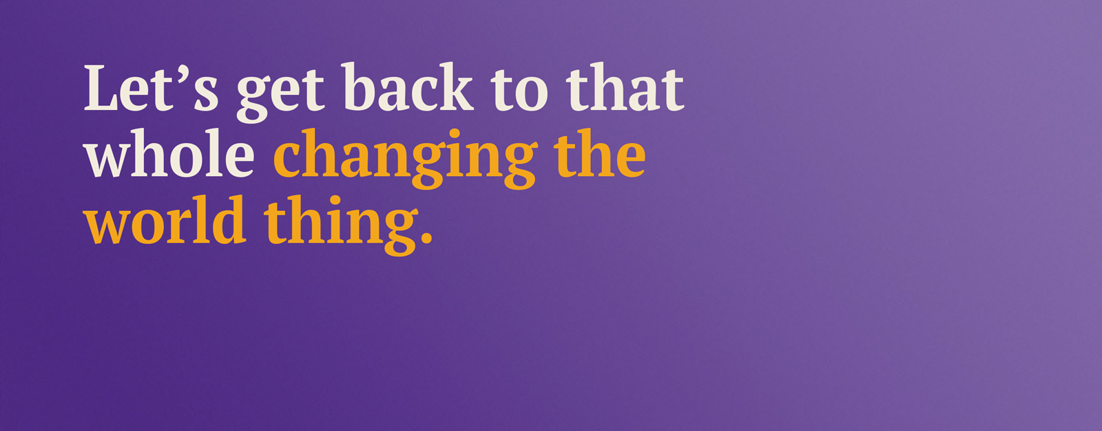
Typographic Emphasis Using Color
As an OPTIONAL TOOL in the design system, color can be used to create points of emphasis within a headlines. This is a great way to add some dynamism to a layout. This should not be done on an arbitrary basis, but rather, the highlighted text should be carefully selected with context and emphasis in mind.