How we use iconography
Icons are small, simple and self-explanatory graphics designed for repetitive use to help audiences quickly navigate specific pieces of information. We have built a full library that includes two different sets of icons for different uses. Note: Any new icons must be approved by athenahealth Global Branding and Global Trademark Legal. Click here to download the approved icon library.
Iconography Design
Two overarching principles give our icons a unique and proprietary look and feel, while ensuring continuity across all of our communications. If you have been approved to develop a new icon to address a specific subject or idea that our library does not address, please use these principles in its development to ensure that it can be added to the library.
Note: Any new icons must be approved by our internal brand team
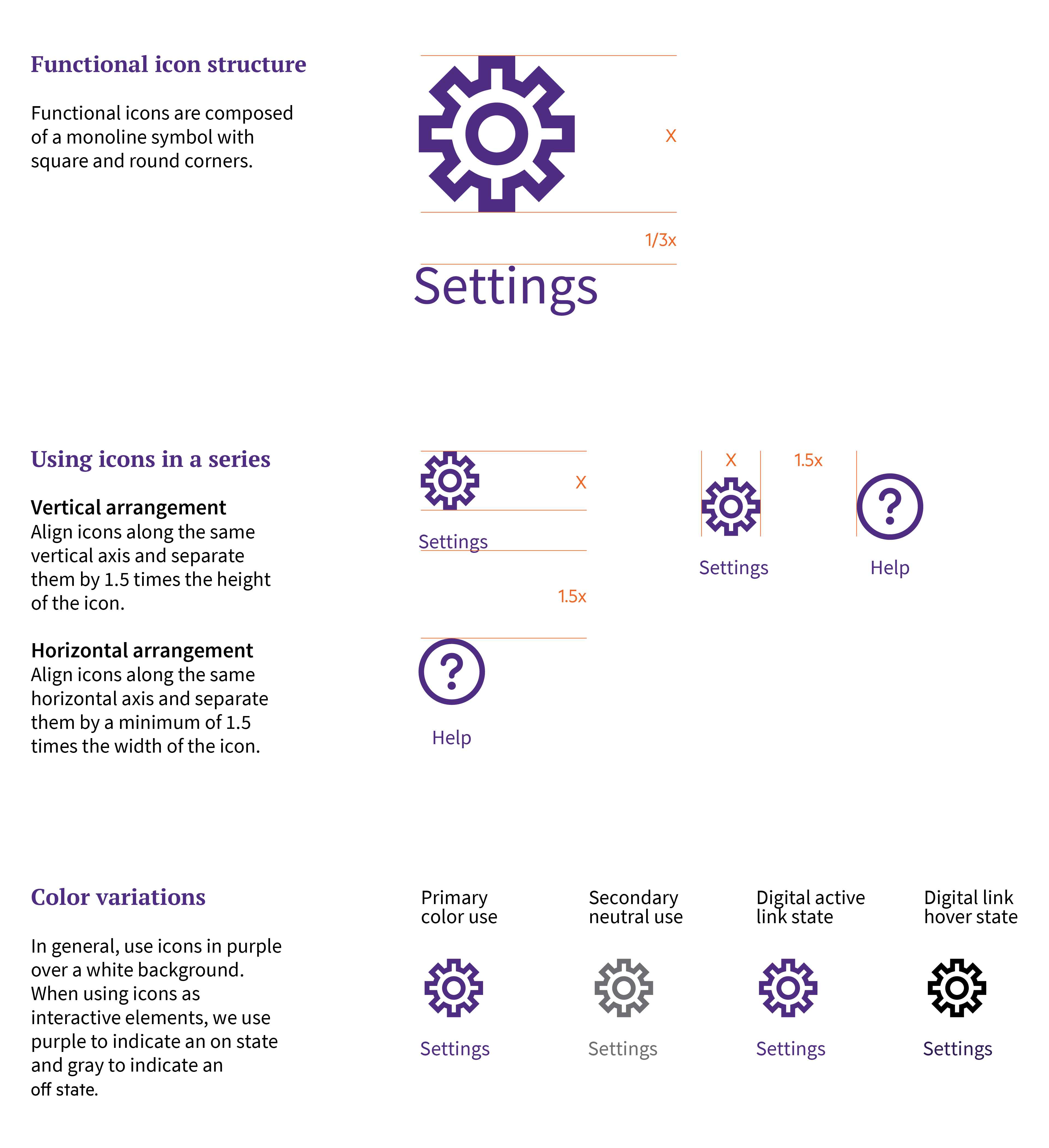
Iconography — Functional
To provide flexibility in addressing specific audience, touchpoint, or messaging needs, we use this family of functional icons, at relatively small sizes for very specific calls to action. Functional icons may be composed vertically or horizontally. Type is center-aligned, with the icon in horizontal and vertical arrangements.
Icons can be rendered as large as media requires (think websites, nourish screens). Strokes should be scaled proportionally and can be adjusted at the final scale to reflect the spirit of the original icon set, while recognizing the specifics of the execution.
Icons can be used in black or brand-approved purple. To scale for use across various our product experiences, our functional icons are rendered at 8px, 16px and 24px.
Note: The minimum diameter of the icon should be 8px. The maximum diameter of the icon should be 24px.
Note: Text labels for icons are optional, though it is generally recommended to have text that relates to the icon in close proximity.
Note: For multiple icons side by side, the text label for all should be the equidistant. Base this distance on the height of the tallest icon in the set.
Note: In horizontal arrangements, ensure that horizontal spacing (Y value) between icons is equal.
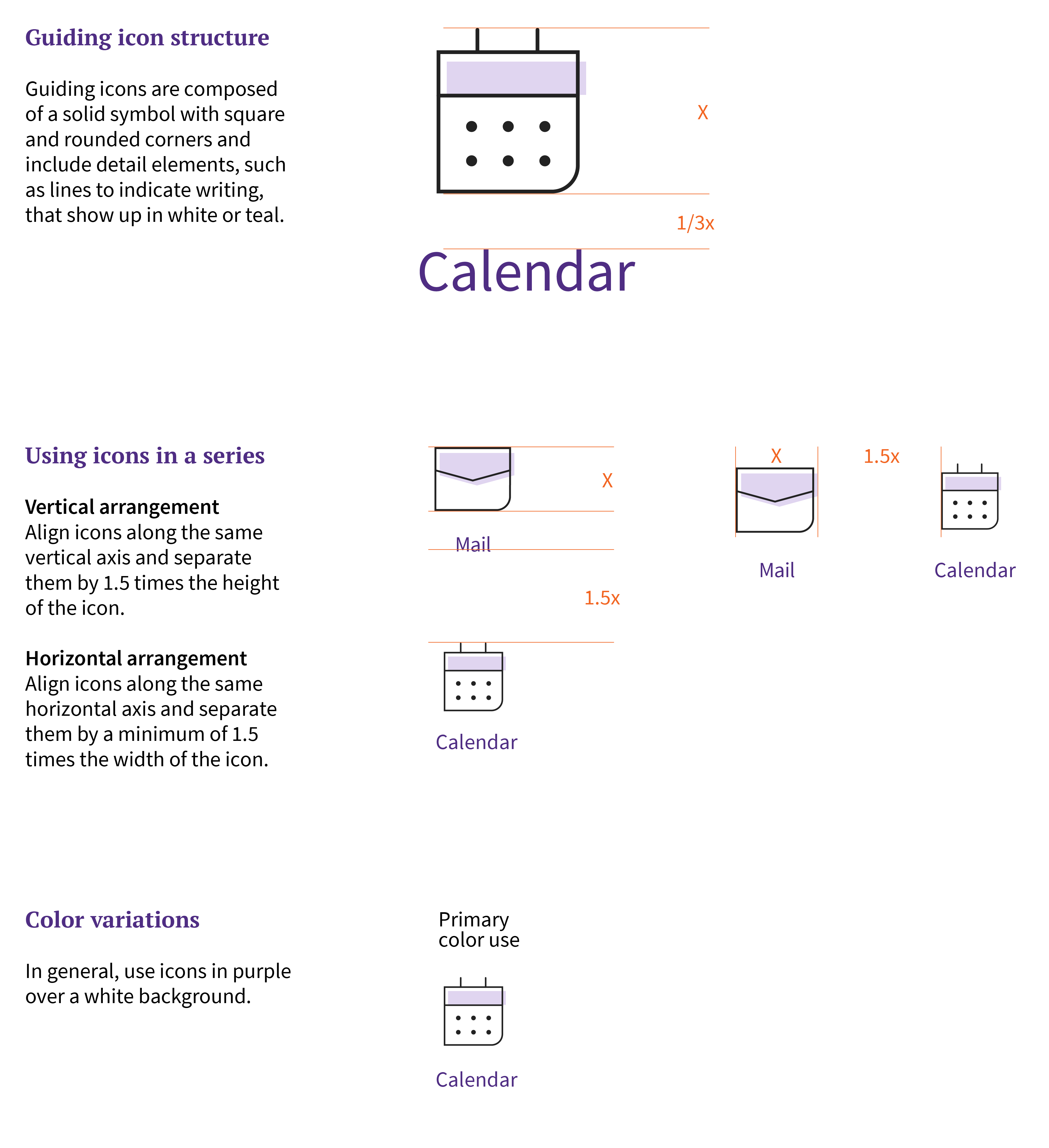
Iconography — Guiding
To create the greatest brand impact and reinforce our unique look and feel, we’ve developed a family of guiding icons to be used as a decorative element within a callout or section, or as a navigational signpost in marketing and product design.
We created a consistent but flexible visual design approach to guiding icons that allows us to reuse the same symbol in different ways to dial up or down the friendliness vs. minimalism of visual styles for different audiences and contexts while maintaining a cohesive, branded similarity across broad usages. Their distinctive design and color make them recognizably us. These icons may be composed vertically or horizontally. Type is center-aligned, with the icon in horizontal and vertical arrangements.
To scale for use across various our product experiences and Marketing collateral, our guiding icons are rendered at 18px, 32px and 44px.
Guiding icons can utilize the brand approved tints.
Note: Text labels for icons are optional, though it is generally recommended to have text that relates to the icon in close proximity.
Note: In horizontal arrangements, ensure that horizontal spacing (Y value) between icons is equal.


